ING DIRECT – Save Your Money
http://home.ingdirect.com/index.html
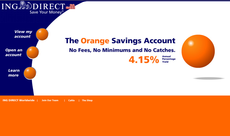
Focal Point/Repetition:
The orange ball is used as a focal point. I had thought that the orange ball was part of their logo because they have used it in their commercials, but not so, the logo has a lion sitting between ING and DIRECT. At some point they have developed the orange ball as a guide. Sort of how, some years back, you would follow the bouncing ball on screen to know what word to sing in a sing-along. It works very effectively to help navigate the web site.
Resonance:
The colors are bright at this site. Bright orange, dark blue and white. No other colors are used and the dark blue is used for the text on the white background. There is a clean, crisp look to the whole site. On the color wheel, the complementary color to orange is blue. Maybe a little lighter than the blue used here, but this blue is not going to fight with the orange as much and it is still it’s complementary color. This has a resonance to it while at the same time providing contrast.
Consistency;
There is consistency throughout this web site. All off the pages have the same navigation scheme. There are balls in an arc on the left and the one that is colored orange is the page that you are viewing. There is also an orange strip across the top with the logo at the left inside of the strip. This repeats on all the pages except the home page.
Originality/Interactivity and Movement:
The home page has a big orange globe that goes bouncing from the front of the screen into the design of the page. It stops on the left, pauses, then moves to the right. It stays there and if you should click on it, it will take you to the products and rates page that has an option to view a demo. I like it because it stops and doesn’t keep bouncing annoyingly and also because if out of curiosity you click on it, it goes somewhere. Also, this orange ball has a shadow underneath it indicating that it is hovering, poised for action.
Homework Index Page