Sender: Meyer, Laurel
Subject: Assignment 4
Critical Mass
Alignment
Everything on this site is well aligned. The navigation buttons at the top are well spaced as are the navigation images and text buttons down the left side. The text body is integrated well in the center in a block form.
Repetition
The theme is repeated well throughout the site. The company name appears at the top of each page as do the four main categories. The text box appears the same beige color on all the pages.
Contrast
The logo Critical Mass has a subtle contrast that emphasizes the word mass. This subtlety carries on throughout this site. There are five colors chosen for the overall design. Four colors for the categories and one for the text box. Using different colors enables you to be aware that you are in a different company area. Each category uses its color as a title box on its pages. There is contrast by the blank space left around all the elements.
Proximity
There obviously been a lot of thought put into the design of this site. All the items are placed well and descriptions are right where they should be. This company designs web sites for some of the biggest companies, such as Dell, Nike, Mercedes–Benz, and NASA. This is an advertisement for their product, web designing. It would be disappointing if it was anything but a professional, well designed, and efficient site.
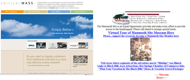
Mammoth Site Museum
Alignment
The top and bottom of the site are centered and the in between section is aligned right. It is almost as if there was an image the text was to the right of and it was removed without changing the alignment. The logo at the top is too close to the top edge and needs space above it. Also the graphics on most of the pages aren’t aligned and look to be placed wherever they landed.
Repetition
The logo and links repeat at the top of each page. Other than that there doesn’t appear to be any repetition within the page or the site. Some pages have the text centered, some left aligned and one has the text extending from left edge to right edge The brown bars to the right of the mammoth logo or the brown color could have been used throughout the page to give continuity.
Contrast
There is contrast with a lot of white space, unfortunately it isn’t planned into the design and just happens. There is no attempt to organize the contrast to lead the reader’s eye to various main points.
Proximity
It all seems a jumble, to the point that on some of the pages the text overlaps, or nearly overlaps, other text blocks. The graphics are good, but the text draws away from them rather than enhancing and describing them. Some of the pages would have benefited greatly by having the text wrap around the images.
Homework Index Page