Sender: Meyer, Laurel
Subject: Assignment 5
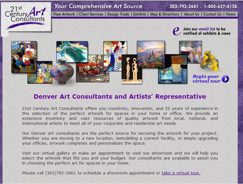
Denver Art Consultants
21st Century Art Consultants
http://www.21stcenturyartconsultants.com/index.cfm
Relationship/Synergy
The color palette is subdued and yet is not the white and gray I found at a lot of fine art sites. There is a lavender gray background overlaid on a purple background. The purple is picked up in the title and the logo.
Direction/Movement/Rhythm
A pleasing rhythm is created with small pictures of artist’s work overlapping at the corners and alternating up and down positions across the top of the page. The movement is aided by the subtle drop shadows on the pictures. It gives depth to the images.
Texture
The purple background is a purple linen fabric design and on top of it another background of slightly mottled lavender gray. The effect is as though the light background is framed by the dark background. It is a good balance and gives texture to the flat screen.
Cropping
There is interest added with the logo in the upper left corner overlapping into the overall rectangle design and cropping out the corner.
Scale and Proportion
One thing I like a lot about this site is that the same scale of the pages is maintained throughout the web site. The page essentially fits the screen, not much scrolling is needed. The scale of the artwork is small on the home page, where there is text describing the business. The artist pages have the work bigger but still maintain the size of the page relative to the monitor screen. I also like that they fit a short biography of the artist on the page with their work. It gives all the information on one page, a distinct advantage to me. The exception is the page where they list all of the artists and it does exceed the size of the screen.
Figure-Ground
Depth is created here by building the layers of the design. The purple background with the lavender gray background on top of it and the pictures on top of that with a shadow to them gives the perception of depth.
Format
The space is used well, it reminds me of a brochure by the way the space is used but not exceeding what is taken in with the eye in one glance. You turn the pages to see more instead of scrolling to look at the rest of the page. A lot of sites try to fit as much as possible on the home page almost as though they think if they put as much as they can there, something is bound to attract your attention. This site, by having the small examples of their art at the top, doesn’t have to clutter the rest of the page.
Homework Index Page