Sender: Meyer, Laurel
Subject: Assignment 6
Assignment 6
Readability
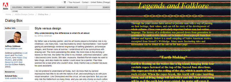
Native American, Legends and Folklore
http://www.merceronline.com/Native/native06.htm
Readability guidelines broken:
The body of this page uses the default type face which is Times New Roman on my pc, therefore a strike against its legibility and readability for using a footed typeface.
The background is very colorful and does make me think of an Indian blanket. It is too busy though to use as a background for text. I tried to think of a color type that would have worked and couldn’t think of any. Maybe white, but it would still be difficult to read.
Except for the opening paragraph and the links at the bottom, all of the text is bold. I think it is an intentional choice to try and make the text more readable but, it didn’t work.
Both color and bold text used on the page. Except for one opening paragraph it is consistent in that format. It detracts from the content, though I didn’t confuse it as hyperlinks.
Readability guidelines followed:
They used a table to control the text and keep it away from the edges and aligned it left in the table. That was a good choice but, there is so much text that I think it should have been divided more, with links to the top in the body. The subheadings should have been left-aligned instead of centered.
Readability
Adobe Design Center - Columns and articles from experts on web design and motion graphics
http://www.adobe.com/designcenter/dialogbox/stylevsdesign/main.html
Readability guidelines followed:
The type used here is sans serif in a good size and line length for readability. It is lowercase and has good lead spacing.
There is a small amount of bold used to highlight the title and to break up the body of the text into readable sections. There is another typeface used for the title that sets it apart. The only color text used is red for the hyperlinks and that works well.
Left alignment is used with one small column to the left and the main body of text left aligned immediately to the right of the info column, with proper spacing between them.
This page has a white background with black type. Everything is done properly on this page. It is easy to read, the links drop down and are easy to follow and even they are aligned left in their boxes.
Readability guidelines broken:
I couldn’t find any rules broken. I tried to read the source code to find the specific font name, but it was too complicated for me. It is a professional job for a professional company. It is just a little too blah for me. Considering this particular article, Style versus design, I find it a little bit ironic that the style loses a little to the substance of the page.
Homework Index Page