APGR 72 Mini-Project 1 Design Critique
Requirements 1. Write a design critique of the existing home page (link above) referring to the following topics from the Week 2 lecture pages (Due April 6th):
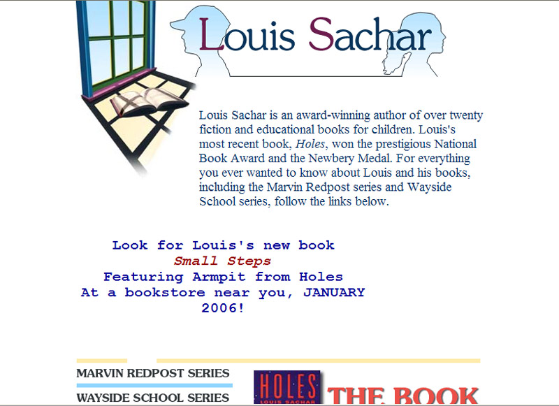
Design Principles: Alignment:
The alignment on this page is center. There is a blurb for his new book that doesnĺt fit in the alignment. The graphic is too close to the top of the page.
Repetition:
There is a better use of repetition on the linked pages than on the home page. The home page doesnĺt have any one unifying color and the text is awkward where the plug for the new book was stuck in without regard to the typeface used on the page. The links are interesting, the color next to the link is the color of the heading of the linked page. But two, complete booklist and author bio, donĺt use the correct color. Almost as if someone changed those links for a design reason and didnĺt follow through and change the colors.
Contrast:
The contrast is good and there is enough space around each element on the page. I donĺt think the graphic at the top is placed in a way that balances the window and the name/child heads. The open book repeats throughout the site, but I donĺt think this is the best way to introduce it. I donĺt know how I would handle this.
Proximity:
There isnĺt enough on the home page to give a good example of proximity. The links are the text, so you canĺt miss those. On the book pages the information is close to the picture of each book.
Design Techniques: Hierarchy:
The secondary pages have better design than the main page. The links below the heading with the book and one child head silhouette are done well.
Focal Point, Eye Flow:
The eye doesnĺt flow through any of these pages in an easy calm manner. The pages listing the books with a picture and description are lined up, but appear scattered about because the length of the text differs. It would have been better to pick a left alignment and if necessary have two columns. The focal point is the window and the two childĺs heads. I like the design, but it could be less confining to the text next to it.
White Space:
White space is used in a good way. There are places where it is too much for the centered text and it is overbearing to the text.
Simplicity, Balance:
The balance is good at the top of the secondary pages, but thatĺs where balance ends. There is almost simplicity if it wasnĺt for the multi-colored type on the headers and the lack of balance in the book pages. The text is centered, but then on the bio page it is aligned left. That page may be my favorite because it looks all of a piece.
Consistency:
No, no, no, not consistent. Well except for the navigation bars on the secondary pages and the use of the book and childrenĺs silhouette. The alignments are different, the text is different type and color, and the pages all have a different look in the body.
Unity/Gestalt:
Strangely, I will say that there is unity in these pages. They are tied together with the nice element of the headers. Also, these pages are meant to be read by youngsters and to make the page too formal would be boring. There needs to be a sense of adventure as you navigate these pages.
Appropriateness:
I think it is appropriate for the age group it is intended for.
Originality:
I think there is originality in the heading and the way it is carried through the other pages.
 Homework Index Page