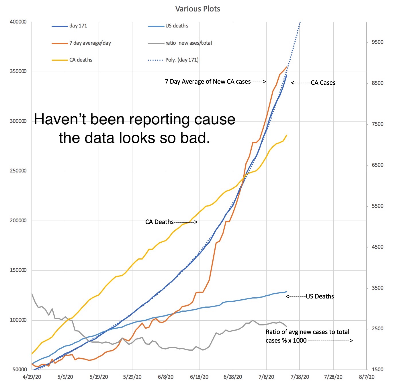
Just trying different plots to try and make sense of this.
Difficult because the reporting isn't uniform (down on weekends)
The arrows on the plot point to the scale to use
The dashed line is a projection done with Excel using a Polynomial fit.
The latest plot is a ratio of the 7 day average cases to the total CA cases.
It is represented as a % and is multiplied by 1000 to fit on the scale to the right
So the current % is about 2.
The data comes from the LA times and "The California totals are from a continuous Times survey of the dozens of local health agencies across the state"
Day 1 was when California was reporting its first case now 1/26/20
increases.
Why am I doing this....Don't really know....What do I hope to prove?... remains to be seen.