| APGR72 Color on the
Web |
![]()
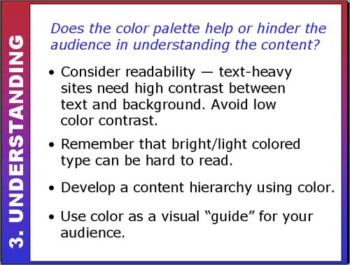 |
Use Color to Enhance Understanding!Color is a great tool for enhancing the content of your site. You can use it for text as long as there is a strong contrast between the text and the background. Even better, use color for subheadings to break up large amounts of text. Be wary of using light or bright colored text since it can be very hard to read. Try this site for readability (and don't forget your headache pills!): Color is helpful for giving the viewer an "instant" visual
understanding of hierarchy of the content. For example, use one color
(or tint/shade) for headings, another for subheadings and a third for
text. Too many colors can confuse the viewer and obscure the content hierarchy
on the page. Does color help or hinder the hierarchy of this page? |
|
| Use the scrollbar at the bottom of this window to view all thumbnails in this section. |
||