| APGR72 Color on the
Web |
![]()
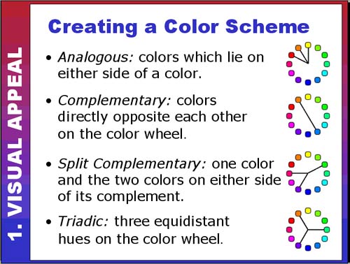 |
Creating a Color Scheme #2Now we get to look at how to combine different colors into an appealing color scheme. Analogous colors are very easy to work with because they are close
together on the color wheel. Designs that use analogous colors tend
to be visually harmonious but may lack dynamism. Look at the following
sites and see what you think: Complementary colors are opposites on the color wheel and have a tendency
to clash at full saturation. They can make for very dynamic and visually
exciting designs (if handled correctly!). What do you think of this
color combination used in two different sites? Split complementary color schemes still give you a strong color contrast
but often with greater harmony (less risk of clashing colors) than straight
complements. Triadic color schemes can create balanced yet colorful designs. At
full saturation the colors may still compete. To try out your own monochrome, analogous, complementary, split complementary,
and triadic color scheme, visit one of the sites below: |
|
| Use the scrollbar at the bottom of this window to view all thumbnails in this section. |
||