| APGR72 Color on the
Web |
![]()
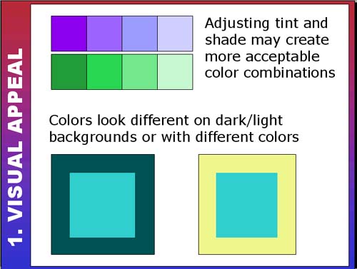 |
Adjusting Color RelationshipsYour client wants to use purple and green but at full saturation those
colors look awful! What do you do? Some clashing colors will actually
harmonize if you adjust their tint, shade and saturation. Here are a
couple web examples of complementary colors (purple and green) that might
usually be dazzling. The tints, shades and saturation have been changed
to harmonize the colors: Look at the squares on the left... Do you think the green box in the center of the yellow and dark green squares is the same color? It is... Be aware that colors change in relationship to each other. |
|
| Use the scrollbar at the bottom of this window to view all thumbnails in this section. |
||