| APGR72 Color on the
Web |
![]()
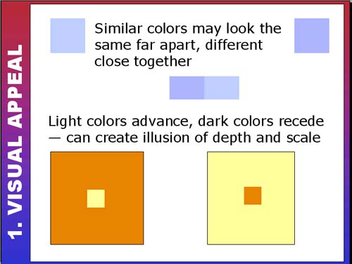 |
Color Relationships continuedIf you're working with a limited or monochromatic color palette, be careful with your color choices. Make sure you create enough contrast between the colors that they look sufficiently different when far apart. There's no point in using two different colors if they can be mistaken for the same one! In the Fine Art Techniques lecture, we discussed creating depth in your web page designs. One method of creating depth is to use dark and light colors. Notice how the small light yellow seems to jump out of the orange square. It also appears to be bigger. This light-dark contrast can be an excellent attention grabber. In this web example, the designer uses light and dark colored shapes
to create depth and interest in the background: |
|
| Use the scrollbar at the bottom of this window to view all thumbnails in this section. |
||