| APGR72 Color on the
Web |
![]()
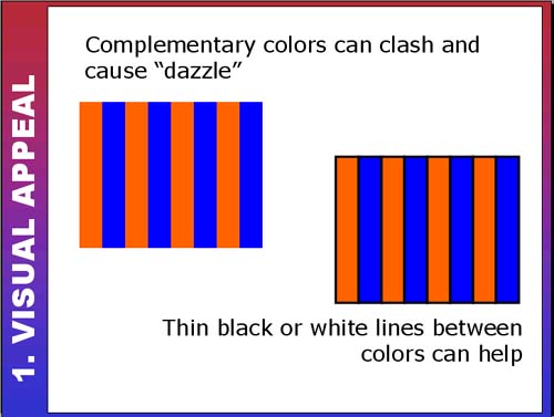 |
Avoiding Complementary Clash!The examples on the left demonstrate how designing with complementary (or very saturated) colors can be like playing with fire! Their effects can be either striking or overwhelming. Sometimes using a white, black or grey can offset those dazzling effects. This site uses areas of white to separate the bright colors in places. The color contrasts are dynamic without dazzling the viewer. This site's colors are bright but not overwhelming. The designer used
a lot of white to offset the bright colors: |
|
| Use the scrollbar at the bottom of this window to view all thumbnails in this section. |
||