

GNU R
GNU R is a powerful open-source statistics and data processing package.
R Cheat Sheet
Creating Basic Data
The most important data types (at least, in my opinion at the time of writing) in R are the vector and the data frame. A vector is just a list of values. A data frame is a table of values, and is the closest thing to the data you'd see in a spreadsheet that you'll find in R.
In R, you can get help on R commands by typing a ? followed by the name of the command. Try each of the following:
> ?vector
> ?data.frame
Try the following command:
> vec <- c("Dollar", "Quarter", "Dime", "Nickel", "Penny")
Read help on the c command to figure out what's really going on here (you may be a bit mystified by the help), but a side effect of this is that it creates a vector named vec. The "<-" thingy between the vec and the c(...) is the assignment operator. It takes the results of the command on the right side and stuffs it into the variable named on the left side. You can now do fun things with this vector, like, say, see what's in it:
> vec
[1] "Dollar"  "Quarter" "Dime"    "Nickel"  "Penny"
You can also pull out individual values from a vector. Note that unfortunately, vectors in R are 1-indexed. Normal people tend to think that this is the normal way to do it, but computer programmers who aren't stuck in the backwards world of FORTRAN like to have their arrays 0-indexed (that is, the first value is number 0, the second value is number 1, etc). For example:
> vec[1]
[1] "Dollar"
> vec[2]
[1] "Quarter"
> vec[3]
[1] "Dime"
Let's make another vector:
> vec2 <- c(1.0, 0.25, 0.1, 0.05, 0.01)
This vector is a bit different because it's made up of numeric types. If you aren't sure of the type of a variable, you can use the class command:
> class(vec)
[1] "character"
> class(vec2)
[1] "numeric"
Mucking About With That Data
As a numeric type, you can do calculational type things with it, such as figure out the average and standard deviation of the values in the vector:
> mean(vec2)
[1] 0.282
> sd(vec2)
[1] 0.4115459
(Remember to try ?mean or ?sd if you want to figure out what these commands do.)
You can also take multiple vectors and combine them together into a data frame. Do this with:
> money <- data.frame(vec, vec2)
> money
      vec vec2
1  Dollar 1.00
2 Quarter 0.25
3    Dime 0.10
4  Nickel 0.05
5   Penny 0.01
The second command just shows us what's in the variable "money". Now it looks like a legitimate table! On the left are bar charts, and on the top are the column names. In fact, what a data frame really has is a collection of vectors (plus some other things that are hidden about). You can extract individual vectors as follows:
> money$vec2
[1] 1.00 0.25 0.10 0.05 0.01
> mean(money$vec2)
[1] 0.282
The dollar sign tells R just to pull out the column (or vector) inside the data frame with the assigned name. Of course, at the moment, our column names are rather unfortunate, and are historical artifacts of the stupid names we chose for our vectors. We could go back and redo the whole thing choosing better names. You do this by manipulating the names() vector of the data frame. To see what this is, just do:
> names(money)
[1] "vec"  "vec2"
We want to rename the vectors, so do:
> names(money)[1] = "Currency"
> names(money)[2] = "Value"
> money
  Currency Value
1   Dollar  1.00
2  Quarter  0.25
3     Dime  0.10
4   Nickel  0.05
5    Penny  0.01
Those first two constructions may seem a little weird to you! What this says is that "names(money)", that whole thing with parentheses and all, is itself the vector that holes the names of the variables in the data frame money. (If you're a comptuer programmer, it may enlighten you to realize that names(money) returns the names array by reference. If you aren't a computer programmer, you probably have no clue what I just said.)
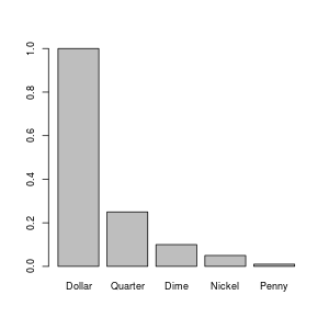
Let's plot our data!!!! \o/
> barplot(money$Value, names=money$Currency)
If you run that, it should pop up a plot on your screen something like:
You might be wondering how I created the image that I included on this web page. I could have just taken a screen shot and used my image processing program (I use The Gimp) to crop it down. However, R can write image files directly:
> png("money_barplot.png", width=300, height=300)
> par(cex=0.75)
> barplot(money$Value, names=money$Currency)
> dev.off()
The png(...) command tells R to start writing plots to a png file. In the language of R, the plot device (i.e. the computer device to which we're sending graphs or plots, not the thing like your uncle died leading you to inherit a myseterious box that led to all sorts of adventures) is now a png file. The dev.off() command tells R to finish with the current plot device (at which point the PNG file is ready for further use, such as being put on a web page), and to revert to the previously used plot device. If you run dev.off(), again, you'll no longer be able to plot to the screen! You have to run the proper device command for your screen to get things going again. On Linux, that would be x11(), but I have no clue what it would be on other operating systems. The par(...) command sets parameters of the plot; in this case, I set the "character expansion" to 0.75, which made all letters 3/4 as big as they normally would have been. I did this because the letters were too big for a 300x300 image by default. If you want to reset all of your parameters to their default values, close and reopen the device.
If you're creating plots to be included in a paper, you probably don't want to use PNG files. You'd rather use something like an Encapsulated Postscript file (using the postscript(...) command). The latter is a vector image, whereas PNG is a bitmap image. The difference is beyond the scope of this document, but if you're preparing images in documents, you really should learn about and understand this sort of thing....
Reading and Manipulating Spreadsheet Data
Suppose you've got a file in a spreadsheet (such as Excel or OpenOffice/LibreOffice). You want to export this data to R so that you can use R goodness on it. On some platforms (such as Windows), you may be able to read an Excel file directly. However, the most general way to do it is to export a CSV file (which stands for "comma separated values"). In LibreOffice, you do this with "File:Save As...", and choose "Text CSV" as the file type and give the file a name ending in ".csv". Select "Filter Options", and make sure that comma is the character being used to separate fields.
You can now read this file into R using the command read.table. Inside R, get help on this command with:
> ?read.table
On this help page, you'll notice that there's another version read.csv that probably has better defaults. Try this with your csv file:
> mergerfeatures <- read.csv("merger_features.csv")
Replace "merger_features.csv" with the name of your csv file in quotes. Now that you've read it... what do you do with it? This command returns a "data frame", a rich R type. You can do a number of things with data frames. The first thing you probably want to do is just figure out what the heck is there:
> names(mergerfeatures)
 [1] "OBJID"     "RA"        "DEC"       "REDSHIFT"  "CORE_DIS"  "BRI_RAT"
 [7] "RAT_ERR"   "DIM_CENTX" "DIM_CENTY" "BRI_CENTX" "BRI_CENTY" "X.TAILS"
[13] "DIRECTION" "CURVE1"    "CURVE2"    "LENGTH1"   "LENGTH2"   "DIS_BAND"
[19] "SHELL"     "INC_BRI"   "INC_DIM"   "BLOBS"     "STAR_SIG"  "ANGLE"
[25] "TAIL1_X1"  "TAIL1_Y1"  "TAIL1_X2"  "TAIL1_Y2"  "TAIL2_X1"  "TAIL2_Y1"
[31] "TAIL2_X2"  "TAIL2_Y2"  "NOTES"
> nrow(mergerfeatures)
[1] 712
Lots of columns, lots of rows! What if you want to look at just some of (a manageable amount) of the data? You can look at just say one column by printing out mergerfeatures$CORE_DIS. That will print out all 712 rows. In this data set, I notice that lots of them are blank, meaning that we don't have all of the data for all sets. What's more, we notice that most of CORE_DIS are numbers, but some are blanks and some are letters. As a result, the data frame has interpreted this data type as a "factor":
> class(mergerfeatures$CORE_DIS[613])
[1] "factor"
This is not what we want here. What we want is for the column to be identified as a number, and things where there are no data to be flagged as such. R does have a way of flagging missing data by the "NA" type. It turns out that because of how factors work, you first have to convert the data to pure character data, and then convert it to numeric data. Do this with:
> mergerfeatures$CORE_DIS <- as.double(as.character(mergerfeatures$CORE_DIS))
Now you've got something you can work with. Of course, you can convert other columns of the data frame using the same sort of command. One thing you might potentially want to do, now that you have numbers, is plot a histogram:
> hist(mergerfeatures$CORE_DIS, xlab="Core Distance (arcsec)", main="Merger Core Distances")
Now that we've converted CORE_DIS so that only things with a numeric value are present, suppose we want to throw out all the rows where the CORE_DIS is "NA" (i.e. not real data). We can do this by subsetting the data frame.
> definedmergers <- mergerfeatures[!is.na(mergerfeatures$CORE_DIS), ]
> nrow(definedmergers)
[1] 388
This is a little weird. What we've done in the brackets is give first the rows, then the columns we want to keep from mergerfeatures. However, to give the rows, we've given it an expression. The function is.na will return TRUE if a value is NA, FALSE otherwise. The exclamation point is a logical "not", which turns TRUE into FALSE and vice versa. The result is that only those rows that have actual data in CORE_DIS are kept in the new data frame definedmergers. We could have (for example) just pulled out the first three rows with:
> junk <- mergerfeatures[ c(1, 2, 3), ]
Instead of is.na, we've just used the c() function to create a vector of the rows we want to keep.
Suppose I've also made sure that the column BRI_RAT is numeric (using a procedure similar to what we did for CORE_DIS above). Now suppose I want to plot the two against each other. I can do that with:
> plot.default(definedmergers$CORE_DIS, definedmergers$BRI_RAT,
               xlab="Core Distance (arcsec)", ylab="Brightness Ratio")
Note that often just plot rather than plot.default will work. However, sometimes you'll find yourself getting a bar plot or a box plot or something else when you just use plot, for arcane reasons. plot.default will give you a good, old-fashioned scatter plot, unles you've mucked up your defaults. Which probably can happen without your realizing it. But, yeah. Whatever.
We can also try other analyses:
> cor(definedmergers$CORE_DIS, definedmergers$BRI_RAT)
[1] -0.2298557
> cor.test(definedmergers$CORE_DIS, definedmergers$BRI_RAT)

        Pearson's product-moment correlation

data:  definedmergers$CORE_DIS and definedmergers$BRI_RAT
t = -4.6402, df = 386, p-value = 4.775e-06
alternative hypothesis: true correlation is not equal to 0
95 percent confidence interval:
 -0.3220441 -0.1333491
sample estimates:
       cor
-0.2298557
What?? Just looking at the plot, I wouldn't have said that the two variables are anticorrelated to high confidence, and yet if you read up on what those two functions say, the p-value tells me that that is the case. What's going on here? Notice that there is a circle up at a core distance of 0 and a brightness ratio of 1. It turns out that there are a whole bunch of data points stacked on top of each other like this. Here's how I figured that out:
> junk <- definedmergers$CORE_DIS[definedmergers$CORE_DIS == 0]
> junk
 [1] 0 0 0 0 0 0 0 0 0 0 0 0 0 0 0 0 0 0 0 0 0 0 0 0 0 0 0 0 0 0 0 0 0 0 0 0 0 0
[39] 0 0 0 0 0 0 0 0 0 0 0
> length(junk)
[1] 49
Let's try doing the correlation throwing out this subset:
> zerosubset <- definedmergers$CORE_DIS == 0
> nonzerosubset <- definedmergers$CORE_DIS != 0
> cor.test(definedmergers$CORE_DIS[nonzerosubset],
definedmergers$BRI_RAT[nonzerosubset])

        Pearson's product-moment correlation

data:  definedmergers$CORE_DIS[nonzerosubset] and
definedmergers$BRI_RAT[nonzerosubset]
t = 0.2811, df = 337, p-value = 0.7788
alternative hypothesis: true correlation is not equal to 0
95 percent confidence interval:
 -0.091356  0.121633
sample estimates:
       cor
0.01531217
OK, that matches more like what I'd expect from looking at the plot! (Also, a priori from knowing what the data are.)
Merging Two Tables
In this case, I actually have two different spreadsheets of data that I want to process together. The first step is to read them in and subset them so that only the rows that actually have data are included in each:
> mergerfeatures <- read.csv("merger_features.csv")
> specdata <- read.csv("spectral_data.csv")
> names(specdata)
 [1] "OBJID"     "REDSHIFT"  "FILE."     "H_B_CT"    "H_B_EW"    "H_B_EWR"
 [7] "OIII_CT"   "OIII_EW"   "OIII_EWR"  "N_II1_CT"  "N_II1_EW"  "N_II1_EWR"
[13] "H_A_CT"    "H_A_EW"    "H_A_EWR"   "N_II2_CT"  "N_II2_EW"  "N_II2_EWR"
[19] "S_II1_CT"  "S_II1_EW"  "S_II1_EWR" "S_II2_CT"  "S_II2_EW"  "S_II2_EWR"
> class(specdata$H_A_EW)
[1] "numeric"
> specdata <- specdata[!is.na(specdata$H_A_EW), ]
> nrow(specdata)
[1] 48
> mergerfeatures$CORE_DIS <- as.numeric(as.character(mergerfeatures$CORE_DIS))
Warning message:
NAs introduced by coercion
> mergerfeatures <- mergerfeatures[!is.na(mergerfeatures$CORE_DIS), ]
> nrow(mergerfeatures)
[1] 388
Notice that I've chosen to subset my specdata data frame by the H_A_EW column (which I know is an important one). This column is already numeric, so I don't have to convert it; I can just throw out all the NA data. Notice also that both data tables have an OBJID column. This is very handy, because we can use it to match the two tables. Unfortunately, in this case, there's a problem: the OBJIDs were interpreted as numeric, but in so doing we lost precision, because there were so many digits! Really, we wish they'd been read in as character data. To fix this, we have to go back and redo the first two lines of the commands above:
> mergerfeatures <- read.csv("merger_features.csv", colClasses="character")
> mergerfeatures$CORE_DIS <- as.numeric(mergerfeatures$CORE_DIS)
> specdata <- read.csv("spectral_data.csv", colClasses="character")
> specdata$H_A_EW <- as.numeric(specdata$H_A_EW)
> mergerfeatures <- mergerfeatures[!is.na(mergerfeatures$CORE_DIS), ]
> nrow(mergerfeatures)
[1] 388
> specdata <- specdata[!is.na(specdata$H_A_EW), ]
> nrow(specdata)
[1] 48
>
Adding colClasses="character" to the read.csv commands reads all data as character data. Unfortunately, this does mean that you have to convert some stuff to numeric afterwards. (If you read up on read.csv, you can figure out how to specify the types of all of the columns at read time, although that could be a pain.)
Now, finally, we can merge! The trick is to use the OBJID column to pick out the right rows of (say) mergerfeatures and add them to specdata. There is a command merge that will just magically do this for us:
> data <- merge(mergerfeatures, specdata)
> nrow(data)
[1] 48
> names(data)
 [1] "OBJID"     "REDSHIFT"  "RA"        "DEC"       "CORE_DIS"  "BRI_RAT"
 [7] "RAT_ERR"   "DIM_CENTX" "DIM_CENTY" "BRI_CENTX" "BRI_CENTY" "X.TAILS"
[13] "DIRECTION" "CURVE1"    "CURVE2"    "LENGTH1"   "LENGTH2"   "DIS_BAND"
[19] "SHELL"     "INC_BRI"   "INC_DIM"   "BLOBS"     "STAR_SIG"  "ANGLE"
[25] "TAIL1_X1"  "TAIL1_Y1"  "TAIL1_X2"  "TAIL1_Y2"  "TAIL2_X1"  "TAIL2_Y1"
[31] "TAIL2_X2"  "TAIL2_Y2"  "NOTES"     "FILE."     "H_B_CT"    "H_B_EW"
[37] "H_B_EWR"   "OIII_CT"   "OIII_EW"   "OIII_EWR"  "N_II1_CT"  "N_II1_EW"
[43] "N_II1_EWR" "H_A_CT"    "H_A_EW"    "H_A_EWR"   "N_II2_CT"  "N_II2_EW"
[49] "N_II2_EWR" "S_II1_CT"  "S_II1_EW"  "S_II1_EWR" "S_II2_CT"  "S_II2_EW"
[55] "S_II2_EWR"
What merge does is look for common columns. In this case, that was OBJID and REDSHIFT. Suppose that we didn't want REDSHIFT to potentially cause problems; we could have first removed it from one of the frames:
> specdata <- subset(specdata, select = -REDSHIFT)
> data <- merge(mergerfeatures, specdata)
> nrow(data)
[1] 48
Box Plots
One thing that's fun to do is to look for factors for which the numeric range of some other variable differ. For instace, in this data set, we have a factor called X.TAILS, which is the number of tidal tails (0, 1, or 2) that are obviously visible in the system. The first thing we want to do is convert this to a factor:
> data$X.TAILS <- as.factor(data$X.TAILS)
What I really want to look at is a quantity that's not currently in my table, but a new quantity. So that I don't have to type it over and over again, I'm going to add a column to the data:
> data$H_A_LUM <- 4*pi * 1e-17 * data$H_A_EW * data$H_A_CT *
                  ( (data$REDSHIFT* 3e10/2.33e-18)^2 )
(For this to work, you'll need to have already converted all of the columns you're calculating with to numeric with as.numeric.) Now that I've got this column, I can use it in a boxplot:
> boxplot(H_A_LUM ~ X.TAILS , data=data)
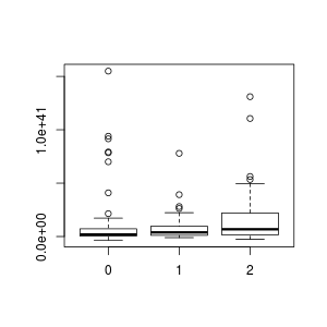
The idiom "H_A_LUM ~ X.TAILS" means plot the numeric values of H_A_LUM, grouping the values by the factor X.TAILS. boxplot, in contrast to plot.default, knows how to work with data frames. You can just give it the column names, and then in the data= parameter give the name of your data frame (which, in my case, was also data) from which to pull all the columns. The box plot is a standard statistical boxplot; read help on boxplot for more information about the defaults. (Note that were I a good person, I would have labelled my axes!)